Case · 2025 · Brand identity
Social Inclusion Institute
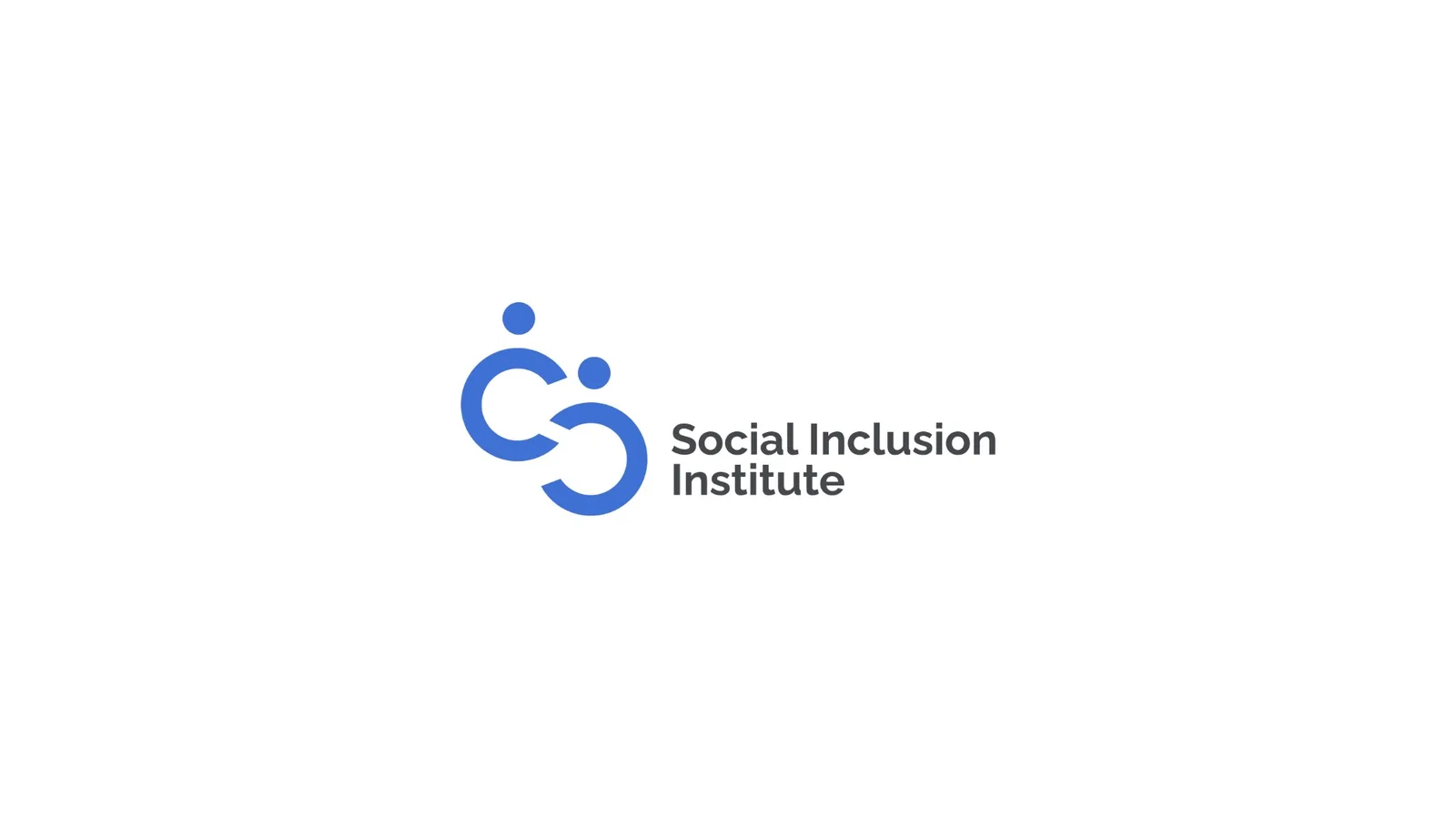
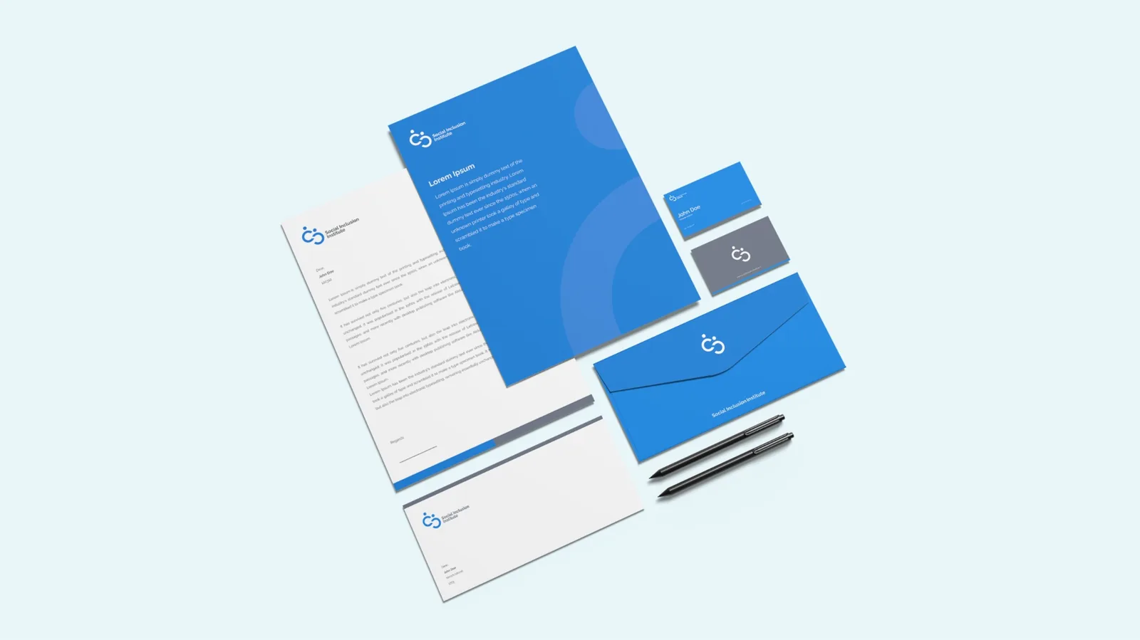
A visual identity built around two interconnected figures, designed to carry the work across every surface.
What social inclusion means.
The process of ensuring that all individuals, regardless of their social, economic, cultural, health-related, or any other background, have equal access to rights, resources, opportunities, and services in society. This includes education, employment, healthcare, political participation, and social interaction.
The goal of social inclusion is to create a fair society in which no one is excluded or discriminated against because of their status, disability, ethnicity, gender, age, or any other factor.
This concept involves active policies and practices that enable everyone to participate equally in all aspects of life and contribute to the community.

Mark and wordmark.
The mark sits left of the wordmark. This pairing is the primary identity unit, used on stationery, signage, and digital surfaces. A reverse version handles dark applications.
Raleway.
Raleway carries the brand voice open, geometric, friendly without being soft. Used across headlines, body, and UI. Seven weights are part of the system.
Five values, one feeling.
Blue represents stability, trust, and security, making it a key element of the visual identity of the Institute. As the primary brand color, it communicates calmness, professionalism, and responsibility.
From soft to certain.
A two-stop linear gradient from a softer day-blue to a deeper, decisive blue. Used sparingly: hero panels, key callouts, never body text.